Easy Steps To Make Your WordPress Images Responsive
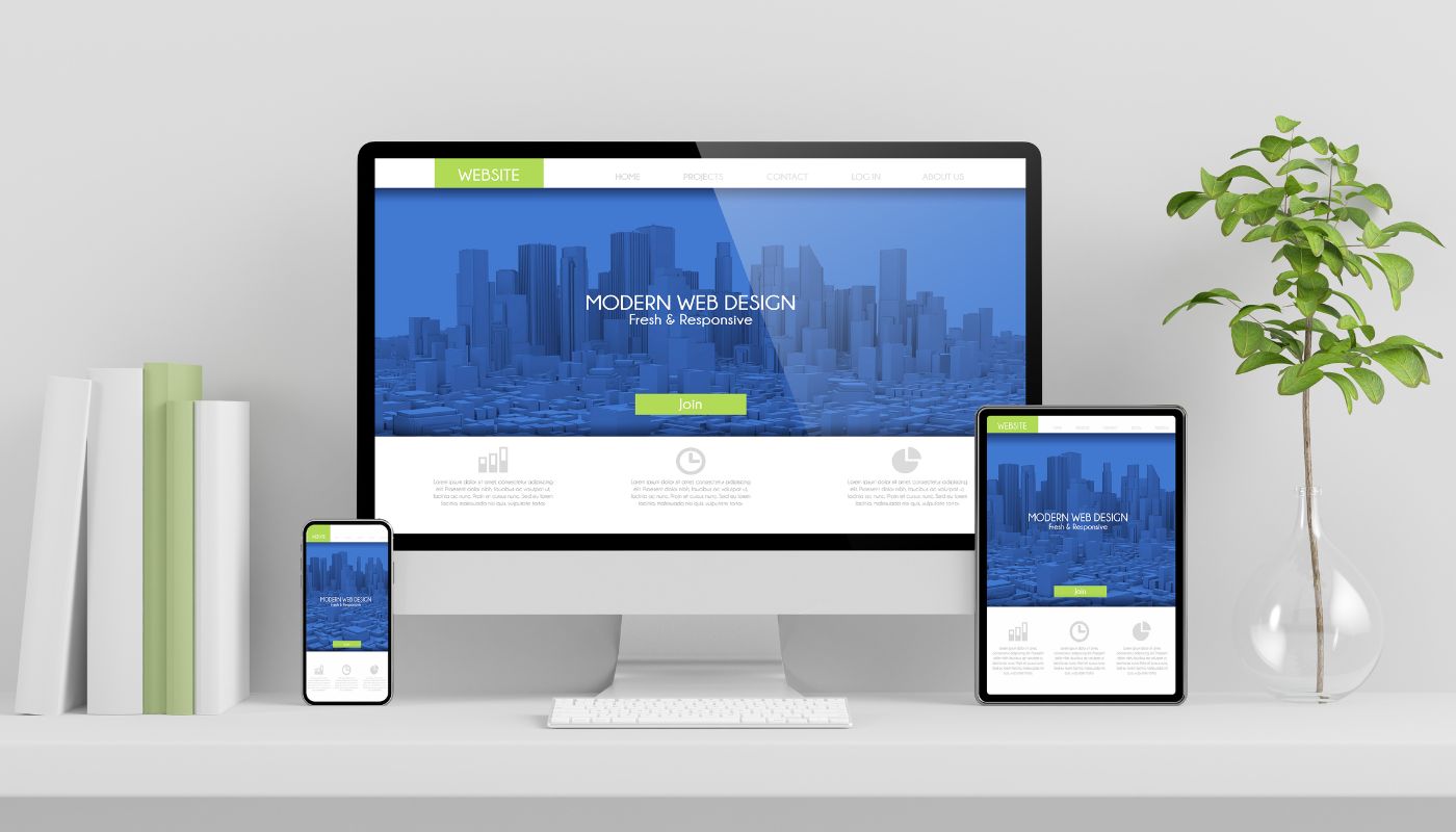
Open Source Content Management System (CMS) WordPress is one of the most influential tools in today’s era. Responsive images make the size of an image fit on all the screens. Making a responsive image and a theme and integrating it is not a difficult task when you understand the basics of themes and ways to use them.
Conversely, Responsive images are not the ones that WordPress compact out of the box. You can apply the steps to generate the image size manually after that HTML editor can be useful to type the image tag and attributes manually. However, this may be time-consuming and create a problem for both users as well admin. So, to make you out of this issue, here in this article we will discuss the convenient ways to make the images responsive.
Table of Contents
- Step #1. Change Function.PHP to create more image size
- Step #2. Install RICG Responsive Image Plugin
- Step #3: Install the Plugin to regenerate image size
- Best WordPress Plugins To Make Your Images Responsive
- Optimising Images for Better Performance
Some of the Easy Step to make your WordPress Images Responsive includes:
Step #1. Change Function.PHP to create more image size
Once you upload an image in WordPress, it saves the images at the local size generating 3 resized copies in these customary sizes repeatedly. The height and width may vary relevant on the image fraction that is:
- Thumbnail (150 * 150)
- Medium (300* 300)
- Large (1024*1024)
This is one of the truly influential features as it will be tailored to develop any size of an image which indicates you do not require making multiple copies of an image in various sizes. You only need to upload a particular image and WordPress will develop the resized copies. This is achieved by changing the file functions.php. Thus, to add up the fresh image size, you have to add calls to the add_image_size function.
Step #2. Install RICG Responsive Image Plugin
When you install RICG Responsive image Plugin and all the image sizes that are activated will be included in the image tag through an attribute called “srcset”. The plugin also contains a responsive image Polyfill called Picturefill.js that includes maintaining the image component and the fresh responsive features for the img element. Along with an attribute srcset, it will now include the image, tags making the image responsive.
Step #3: Install the Plugin to regenerate image size
After the above step, now, it’s time to install a plugin to regenerate image size. You can do this easily through Regenerate thumbnail plugins. This plugin goes through every existing image parts, and also regenerates the size of fresh images relevant to the new one created with functions.php. Additionally, it is recognised as a real time saver and only needs a single button click.
After you install it, go to tools, then Regenerate Thumbnails. After that, click on the button “Regenerate all thumbnails”. When you click on that button status bar appears, and then you can view the details regarding the number of images that have been resized.
Best WordPress Plugins To Make Your Images Responsive
One of the best ways to make your WordPress images responsive is to use plugins. It pretty much automates the process of managing your images and utilising them in the best possible way. Compressing images and making them responsive is crucial in today’s world. This then aids in improved website performance by reducing website load speed which in turn helps your website rank.
WP Smush
WP Smush is a popular image optimisation plugin with millions of downloads in the plugin store. The plugin focuses on enhancing website performance by optimising and resizing images without compromising quality.
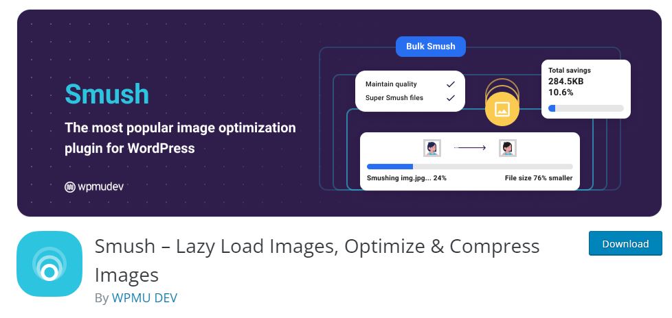
WP Smush offers all the necessary features to make images responsive and even more:
- Automatic image compression upon upload
- lazy loading for images (which means images are loaded as users scroll down the page)
- Bulk-optimise existing images within your media library.
- Supports a variety of image formats
- User-friendly interface that makes the optimization process seamless.
ShortPixel
Shortpixel is another popular WordPress plugin that you can make use of to make images responsive and other image optimisations. One of the reasons for its gained popularity is its ability to convert images to the WebP format. The format is widely known for its smaller file sizes and improved web performance.

You have the option to optimise one or more plugins at a time with ShortPixel. If you are looking for real improvement in website speed from image optimisations, consider using this plugin.
Imagify
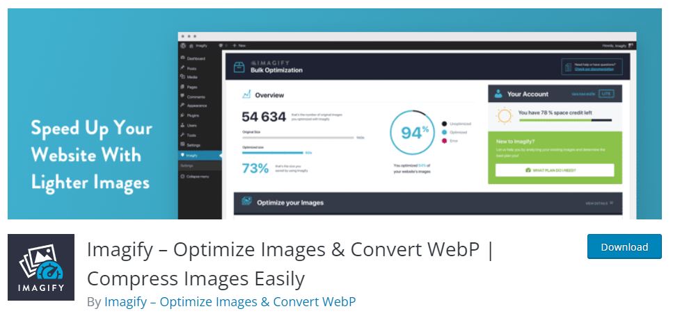
Imagify is another WordPress Image compression plugin that is easy to use and offers quick optimisation methods. You get the choice to choose the image quality you want and the size that meets your needs. But you may rather want auto image optimisations and Imagify can certainly help you gain that.
EWWW Image Optimizer
If you are looking for an automatic image optimisation plugin, EWWW Image Optimizer is the one for you. It has a huge support community and advanced features. The plugin automatically optimises images upon upload, reducing their file sizes to match acceptable quality levels. The plugin supports the conversion of images to the WebP format as well.
TinyPNG

TinyPNG works its magic using clever techniques that trim down the size of your WEBP, JPEG, and PNG image files. TinyPNG is one of the most used WordPress image compression plugin with over 200K downloads in the WordPress plugin store. The plugin can be used in multisite with a single API key and if you are working with eCommerce website, it is WooCommerce comaptible as well.
WP-Optimize – Cache, Clean, Compress
WP Optimize plugin is more of all in one plugin with features such as image and database optimisations. If you are looking for all in one plugin to boost your website performance, this might be the plugin to go for. It is one of the most popular optimisation plugins available for WordPress.
Optimising Images for Better Performance
To maximize website performance, adhere to these best practices for optimizing images:
Select Appropriate Formats
Choose the image format (JPEG, PNG, or WebP) that best suits the content and quality required.
Compression is Key
Utilise image optimisation plugins or online tools to compress images while maintaining visual quality.
Dimension/Resolutions Matters
Set image dimensions based on where they will be displayed to avoid unnecessary resizing by the browser.
Lazy Loading Implementation
Incorporate lazy loading to ensure that images are only loaded when they come into view, reducing initial page load times.
To Wrap Up,
Now, you contain responsive images. Once the images within your online presence become responsive, the browser chooses the most suitable images to download. Visitors using portable devices will acquire the quality image of smaller sizes. This makes your online presence load more speedily with a quick download.
Are you looking for a WordPress developer in Sydney? If yes, connect with us now.
